
SkipTheDishes Discovery
Solving ambiguity to unblock restaurant sign up
The challenge: Discovery to increase restaurant sign up by 25%
Business goal: Increase restaurant sign up and decrease onboarding time
Role: Product designer, collaborating with a researcher
Artifacts delivered: Service blueprint and website concepts

Goals

Business wanted to increase restaurant sign up rates by 25%.
The ask was to find out where the blockers were to increase new restaurant activation and propose solution, to onboard restaurants faster, so we could release our team capacity to expand our network. And additionally, reduce sign up drop offs.
Problems

-
The company wanted to understand why 25% of customers didn’t complete the sign up process
-
There was lack of clarity why the activation process was taking 2x longer than UberEats.
Success metrics

-
Number of restaurants completing the onboarding from sign up to first order
-
Customer satisfaction (onboarding)
-
Time of activation reduced
Process and collaboration

The approach
-
Discovery - to understand pain points and opportunities
-
User testing of sign up page
-
Review research data (restaurants onboarded) and interview new ones
-
Service blueprint

Collaboration

Customer pain points

Who were the customers:
Restaurant owners, many owers of small businesses that were unfamiliar with Skip plan details.
Pain points:
-
No visibility of plan options and value proposition
-
No clarity of what customers would get as a partner
-
Sign up page look & feel was not representative of their brand and had accessibility issues
-
Uncertainty of the next steps to be part of the network and how long it would take to start receiving orders
-
Many customers were not tech savvy
Onboarding Deep Dive
Service blueprint
I met stakeholders of each department that touched the user journey from sign up to activation - across Canada - and mapped the entire process, with KPIS and pain points.
With support of a researcher, we recruited and interviewed restaurant owners in Canada that had been recently onboarded to the platform and learn about their experience.


The service blueprint was giving us hints of why it was taking 2-3 weeks to activate a restaurant
Some departments didn’t have the visibility of the entire process so they learned how they were impacting the entire process by not collecting right data from the customers.
We learned the customer’s case was moving backwards in the queue sometimes
Existing sign up page


-
Customers left the page with unanswered questions
-
After applying, it was not clear what to expect. Some customers didn't answer their phone or checked their email because ther were not expecting a call or message.
Themes & principles
Themes
Support decision making
Learn about eligibility and
pricing
Accessible sign up form
Know what to expect
Principles
Transparent
Friendly
Inclusive
Familar
Inspire confidence and trust

As a business, do you see yourself there? Do you feel positive and inspired?
Prioritization exercise
Some ideas were discussed while ideating the solution

A redesign of the landing and thank you pages
Clear Value Proposition
Use of Social Proof
Conversion-Focused
High Scannability
Next steps


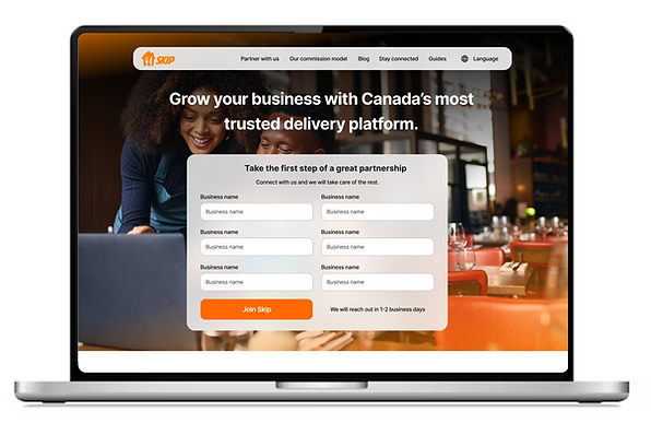
Before & After
Original landing page

New landing page


Original Thank you page

New Thank you page

Artifacts and initial impact
-
Multiple presentations were hosted to inform multiple internal departments about the user journey provide awareness of gaps
-
Visibility of points of friction on the application processes
-
Alignment between multiple teams.
-
Influencing strategy (new projects to potentially ensure QA of data collection).
-
Investigation of parts of process could be automated (new project)

Next steps
Redesign sign up page recommendations were shared with marketing teams that owned that experience
The recommended next step was to A/B test the new sign-up page and follow up with departments to identify process improvements or assess automation.